
前言
Material-UI(后面简称 MUI)是一个很棒的 UI 库,我经常在我的一些项目里用到这个库,但在 Gatsby 中,使用 MUI 还需要一些额外的依赖和操作。以本人的使用经验来看,若不执行这些操作,会导致页面中的 MUI 组件样式加载有“延迟”,比如在我使用 Button 组件时,刚进入页面时展示的是默认样式的 Button(方正、白色、有边框),过肉眼可观的一段时间后才会变成 MUI 的样式,还有 SVG 图标也是一样,会在一瞬间从大(大概有 96px 那样?)变到你指定的大小,还有种种就不在这里说了。解决方式也很简单,这也是本文下面要说的。
使用依赖
MUI v4
在 MUI v4 中,需要使用 gatsby-plugin-material-ui,依照文档安装并启用即可解决上述问题。
MUI v5
到了 MUI v5,从官方的安装文档可以看到,这个版本开始 MUI 需要额外的样式依赖,你可以选择文档中提到的 @emotion/styled 或者 styled-components,在 gatsby-plugin-material-ui 的这个 issue 里,开发者有提到 MUI v5 不需要再使用这个插件了:
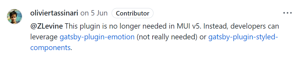
但后面又改口了 ↓
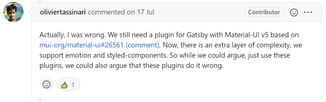
所以现在 gatsby-plugin-material-ui 的开发者们已经开始为 MUI v5 做适配了,不过截至我写这篇文章,这个组件还只支持 @emotion/styled,下面我分别分享一下在 Gatsby 中要如何使用依赖 emotion 和 styled-components 的 MUI v5。
使用 emotion 解决方案
-
安装依赖
npm install gatsby-plugin-material-ui @mui/styled-engine @emotion/react @emotion/styled # 或 yarn add gatsby-plugin-material-ui @mui/styled-engine @emotion/react @emotion/styled -
修改
gatsby-config.jsmodule.exports = { ... plugins: [ ... 'gatsby-plugin-material-ui', ], };
即可!
使用 styled-components 解决方案
根据 MUI 官方的 styled-components 切换指南,需要修改 Webpack 的配置文件,否则会出现找不到 @emotion 组件的相关错误,但到了 Gatsby 这里,需要在 gatsby-node.js 修改 ↓
exports.onCreateWebpackConfig = ({ actions }) => {
	actions.setWebpackConfig({
		resolve: {
			alias: {
				// next 通道安装的应使用此配置
				'@material-ui/styled-engine': '@material-ui/styled-engine-sc',
				// latest 通道安装的应使用此配置
				'@mui/styled-engine': '@mui/styled-engine-sc',
			},
		},
	});
};
由于 MUI v5 的 bata 版本(@material-ui/core@next)和 stable 版本(@mui/material)的包名不同,所以需要根据实际情况(你安装的版本)选择上述两种配置中的一种(两种都选也可以),此外,如果你没有安装这些依赖的话(应该不可能),你还需要安装 gatsby-plugin-styled-components 和 babel-plugin-styled-components
执行完以上步骤后,应该就能舒适地在 Gatsby 中使用依赖 styled-components 的 MUI v5 了,目前为止只执行这些步骤已经能让我的网址正常使用 MUI 组件了。
styled-components 背刺 (更新于 2021/12/19)
这两天我一直在处理一件事,就是我的一个 MUI 组件样式有些许问题,如下图所示,打包之后,我的夜间模式按钮出了问题(调试环境下正常):
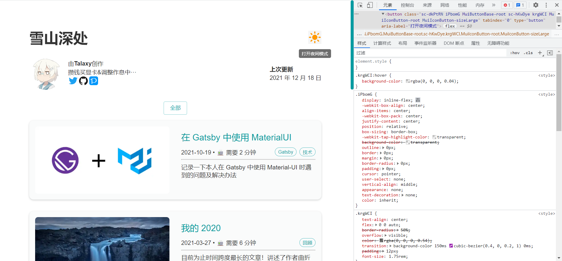
右下角显示的两个样式,正常来说后面那个 (.krgWCI) 应该具有更高的优先级,因为这是 MUI 组件的样式,而非前面那个 (.iPbomG) 默认的按钮样式,默认的样式将 MUI 组件的样式覆盖了,这导致夜间模式按钮在 hover 后背景变成了方形······
我尝试更换了相关组件的版本,但是无济于事,今天我发现官方的切换文档在 16 天前更新了,也就是上面放出的这个 styled-components 切换指南,文档中提到
Using styled-components as an engine at this moment is not working when used in a SSR projects. The reason is that the babel-plugin-styled-components is not picking up correctly the usages of the styled() utility inside the @mui packages. For more details, take a look at this issue. We strongly recommend using emotion for SSR projects.
我的翻译:
目前使用 styled-components 作为服务端渲染 (SSR) 项目的样式引擎时无法工作。原因是 babel-plugin-styled-components 没有正确获取 @mui 软件包中的 styled() 方法。欲了解更多详情,请查看这个 issue。我们强烈建议在服务端渲染 (SSR) 项目中使用 emotion。
所以在问题修复之前,我还是老实的使用 emotion 方案吧😭
后续 (更新于 2021/12/20)
今天把我的样式库替换为 emotion 了(我不能忍受我的项目里同时存在两个功能相同的依赖),可以说是无痛切换,甚至我 vscode 的 style-components 的插件还能正常使用,毕竟这两个样式库的 styled api 太相似了
Preview: